Ready to take a color detour on your website? We’re diving headfirst into the realm of the bold and beautiful.
Hang in there, ’cause we’re about to splash some unconventional hues on your digital canvas. From electric lime to deep violet, let’s inject some personality into those pixels!
Chromatic Daredevil: Embracing the Bold
If you’re itching to stand out in the digital crowd, start by tossing the safety of whites and grays out the window. Opt for a vibrant palette that screams uniqueness. Let’s say you go full-throttle with an electric lime green – bam, it’s not just a color, it’s an instant mood booster!
Use this zesty shade sparingly to highlight key areas like CTAs or important announcements. It’s like having your own website cheerleader, hyping up your visitors right from their screens. Just don’t overdo it though; you want excitement, not an eye-sore.
Mellow Vibes: Soothing Unconventionals
Now, how about the flip side? Not all striking colors need to slap you in the face. Consider a subdued yet unexpected pastel like lavender or a soft turquoise that can create a relaxing vibe. These aren’t your typical corporate blues or sterile medical-site whites. They’ve got personality and put users at ease, while still being offbeat enough to leave an impression.
Imagine a background in sheer lilac, for instance, giving off serene spa vibes even if you’re selling high-tech widgets. It’s all about balance; using these milder tones lets you marry tranquility with character without overwhelming visitors’ retinas or forgetting about your content.
Night Mode with a Twist
Sure, dark themes are all the rage for easing eye strain, but let’s kick it up a notch. Ever thought of inky backgrounds spruced up with neon accents? Picture a deep midnight blue canvas peppered with hot pinks and electric blues that guide the user journey.
This isn’t just an aesthetic choice; it’s functional brilliance. The high contrast not only looks sleek but also makes key elements leap off the page – perfect for navigation bars or important widgets. It’s like your website is throwing its own cool, cyberpunk-themed party and every visitor has a VIP invite!
Changing the Iconic Color of Something (e.g. Blue Roses Instead of Red Roses)
Let’s talk about remixing the classics – because who says you need to stick with tradition? Take something iconic, maybe as revered as red roses, and give it a twist. Introduce blue roses to your web design; use them in place of typical images or icons for an effect that’s refreshingly unusual.
It’s not just about flowers, though – apply this strategy anywhere on your site. Shake up standard icons with colors people wouldn’t expect but will definitely remember. It’s like giving users a sip of something different in a sea of the same-old, creating visual bookmarks in their minds that say “hey, remember this cool spot?”
The Art of Color Juxtaposition
Playing with colors is like mixing spices – get the combo right, and you’ve got a feast for the eyes. Think color juxtaposition, where you pair up hues from opposite ends of the spectrum for that ‘wow’ factor. How about tangerine buttons on a teal backdrop? It’s not just striking; it’s client-magnet magic.
This technique isn’t just throwing random bright colors together though – there’s a method to this madness! By strategically placing complementary shades next to each other, you create visual hotspots that guide users exactly where you want them – your latest post, your shop button, or that sneaky little subscription form. Get these pairs right, and watch as they become silent narrators guiding every click.
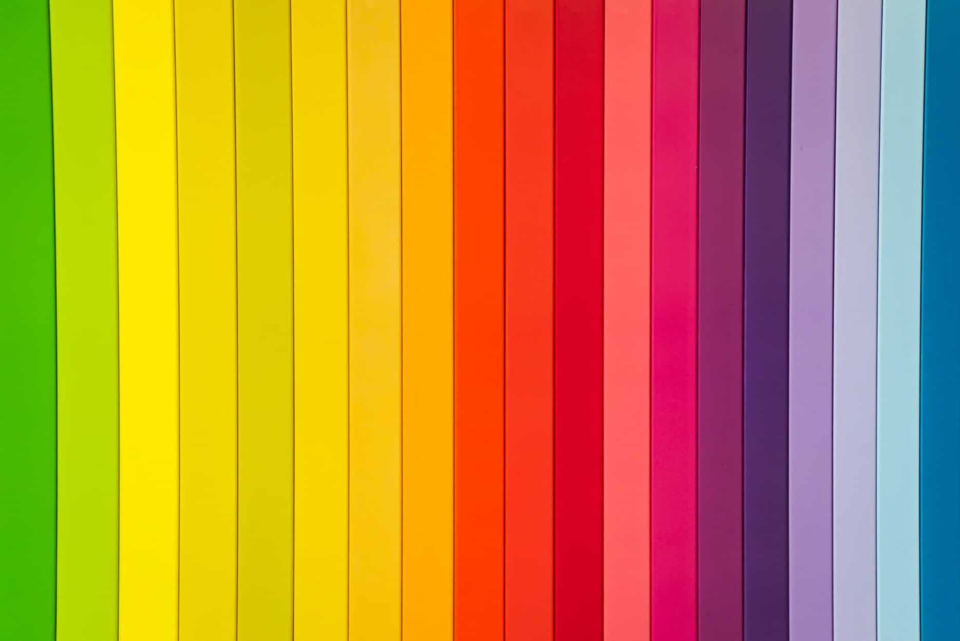
Sunset Gradients: The Unorthodox Heroes
Who says gradients had their moment? No way. But let’s veer off the linear path and grab inspiration from nature’s color palette—think sunset gradients. Envision a fiery blend of purples, oranges, and pinks that melt into each other across your header, kindling a sense of warmth and wonder in your visitors.
This isn’t just some background prettiness; it’s a strategic playbook move. These gradients can pull eyes to critical content or create backgrounds that make overlayed information leap out. Plus, they tell a story – from dawn till dusk, this color fade suggests continuity and flow, almost like there’s never-ending content to explore on your site.
The Last Word
And that’s a wrap on jazzing up your digital digs with colors that pack a punch. Remember, whether it’s through bold statements or nuanced whispers, color can be your secret weapon. Experiment and have fun—after all, your website should be as vibrant and unique as the ideas it represents!