Product Collection Pages: Design Tactics That Boost Ecommerce Conversions

Ensuring a stellar UX performance on your ecommerce site is crucial for securing high conversion rates. So, if you’re looking for ways to boost sales, it’s more than worth investing resources in the overall user experience of your web visitors.
But here’s the deal. Most business owners focus on their home and product pages. And that means product collection/listing pages (PLPs) often get overlooked. Yet, according to UX research, most PLPs achieve mediocre performance, which has a palpable negative effect on the shopping experience.
So, if you’re looking to maximize your site’s sales potential, consider investing in product collection page design. Below are the six best design tactics to wow your audience and boost ecommerce conversions.
Instant Add to Shopping Cart
One of the biggest misconceptions business owners and designers have about product collection pages is that they’re simply a connecting step of the buyer’s journey. And sure, this may be true in some cases. Still, it’s important to note that PLPs are crucial for moving consumers from the top to the bottom stages of the sales funnel.
Look at how people make buying decisions. You’ll find that most of them start by searching for solutions to their pain points. Then, they conduct product research to identify the type of product that best fits their needs. And finally, they make purchase decisions by opting for their favorite solutions.
However, what you must remember about consumers’ shopping behavior is that some buyers prefer a short and efficient buying process. That’s why you have to optimize PLPs for impulse and instant purchases.
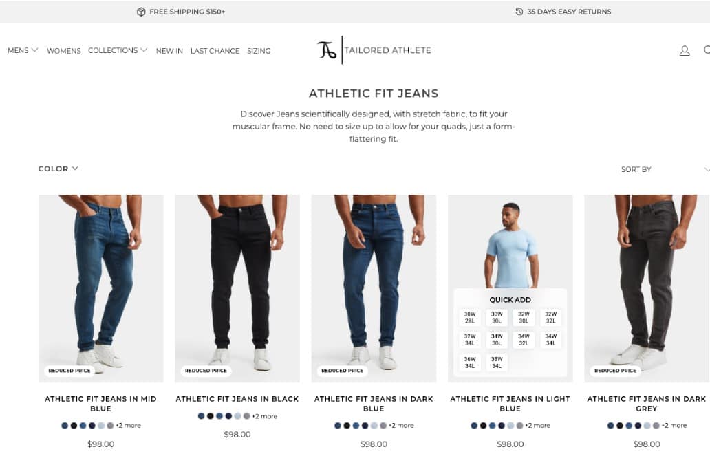
One way to do this is to include an instant add-to-shopping-cart function on your collection pages. That way, you can help your customers solve their pain points more quickly. And there are other benefits to giving web visitors a hassle-free purchase experience. For one, they help boost customer experience. Plus, they can maximize your web visitors’ chances of returning to your store due to the convenience of purchasing through your site.
To see a great example of the instant add-to-shopping-cart UX design tactic, check out the Athletic Fit Jeans PLP on Tailored Athlete. Here, buyers can add products to their carts and complete their purchases in a few clicks. But the brand also notes how important fit is for its shoppers. That’s why the UI permits size selection right on the collection page.
Product Customization Views
Some shoppers may be willing to buy instantly. Still, others will need more info before committing to a product.
During the evaluation stage of the buyer’s journey, people look at multiple factors to gauge whether a solution is the right fit for their needs. But, what most marketers forget is that 81% of retail shoppers research their purchases before buying.
With this in mind, you must empower your web visitors. Give them tools that help them evaluate your solutions. And prioritize convenience during the product comparison process. That way, they’ll have all the info they need at their fingertips. And they won’t have to navigate between multiple product pages to make a buying decision.
One excellent way to use design to make your PLPs more user-friendly is to make these pages as informative as possible.
Start by naming products in a genuinely descriptive way. Include short product descriptions below each product pod. And consider additional ways to enable evaluation and comparison.
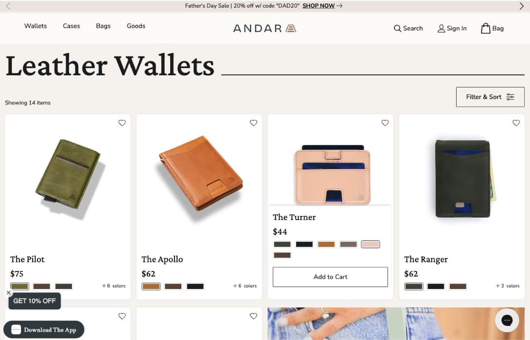
For example, one common best practice for PLPs is to include alternative product views with at least three scrollable product images. However, to take this UX tactic to the next level, why not enable product customization views?
Check out the Andar Leather Wallets collection page. The brand goes above and beyond in helping shoppers choose the best wallet for their needs. Each pod includes several product photos showing the item from various angles. Moreover, users can even select their preferred product color to help them quickly find the best option for their needs.
Discounts and Conversion Incentives
What do shoppers look for when comparing solutions these days?
Consumer behavior research shows that today’s buyers are increasingly price-sensitive:
- 92% of shoppers conduct in-depth product research to discover the best shopping deals.
- 76% of shoppers are trading down to save money.
- 29% of shoppers use price comparison sites to ensure they’re getting the biggest bang for their buck.
With this in mind, consider adding financial conversion incentives to your website. Specifically, show off discounts and deals on your product collection pages. That way, you can attract consumers’ attention to a portion of your products. You can also inform them of the benefits they can unlock by increasing their average order value (AOV).
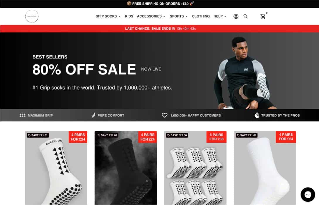
To see a great example of this design tactic, check out the Midcalf Grip Socks PLP on Gain the Edge Official.
This brand includes several conversion incentives on the collection page, knowing its audience wants functional products at a fair price. Note how the hero section advertises an 80% off sale. Also note how each product pod specifies the amount customers save when buying a bundle.
Finally, don’t miss the Free shipping banner at the top of the page. It additionally emphasizes the cost-effectiveness of buying in bulk.
Social Proof
When evaluating brands and products, today’s consumers don’t just want a great price and a user-oriented shopping experience. They also require a guarantee of credibility and quality.
So, as you explore conversion-inspiring design tactics for your product collection pages, don’t forget to show off some social proof.
Displaying star ratings, like Transparent Labs did on the Pre-Workout Supplements page, is an excellent way to show shoppers that your solutions have a high satisfaction rating amongst customers.

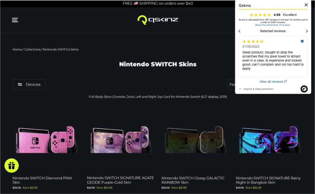
Or, if you’ve got the room, consider showing off more advanced social proof elements on your PLPs. For example, a feedback flyout, like the one on the Nintendo Switch collections page on the Qskinz website, can be a great way to show off the positive feedback you’ve received about your products or customer service.
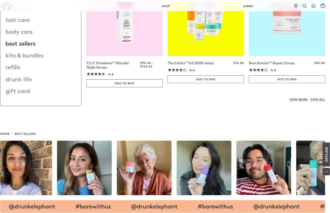
Finally, don’t forget to play around with any alternative instance of social proof that could help you communicate your brand’s reliability or highlight the quality of your products. For instance, the Best Sellers page on Drunk Elephant features a UGC section toward the bottom, showing dozens of satisfied customers with their favorite skincare products.
Versatile Filtering Options
Sometimes, the best way to boost ecommerce conversions on product collection pages isn’t to up your sales tactics. Instead, it’s to make the product selection as convenient for your audience as possible.
One easy way to do this is with product filters.
According to UX research, 80% of shoppers use price filters when scrolling through collection pages. Moreover, when asked about UX features that could boost their shopping experience, 41% of buyers said they wished for better filtering of search results.
Considering these findings, one of the best ways you can enhance the sales potential of your PLPs is to make them more customizable to reflect your web visitors’ needs.
Adding various filtering options to your collection pages is an excellent way to make the product selection process more user-friendly.
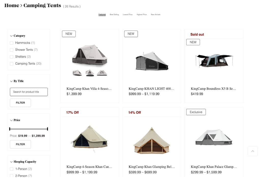
For a great example, check out the Camping Tents page on KingCamp. Note how this brand allows shoppers to filter products based on type, category, price, and best use. Moreover, check out how KingCamp lets customers sort results based on their top priority, whether that’s price, novelty, or rating.
Faux Product Pods
Lastly, as you explore design strategies to boost conversion rates on your PLPs, consider utilizing unexpected ways to use your product pods.
Breaking up the sales-oriented layout with user-friendly elements like social proof or entertaining content can provide a respite for shoppers. Plus, it can give you a unique opportunity to reinforce your brand’s values and mission. It can also help remind your prospects of the implications of supporting your ecommerce business.
For example, TOMS is a brand that built its reputation based on its commitment to helping underprivileged communities. So, to reinforce its dedication to social issues, the business uses a faux product pod on the Men’s PLP. Here, instead of advertising a product, TOMS invites shoppers to watch a film about what the organization does to provide mental health resources. The brand knows that one of the primary reasons people buy TOMS in the first place is because they like their charity work.

If you want to use faux product pods in other ways, you absolutely can. They can be a great way to upsell and boost AOV.
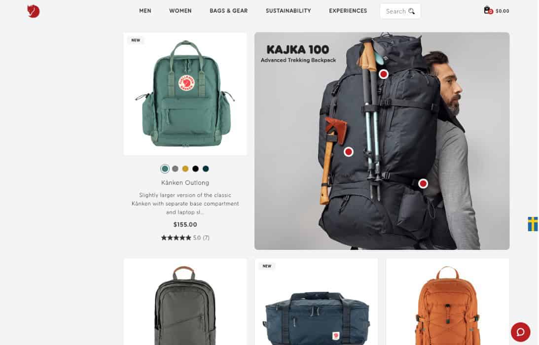
Check out the Fjällräven Backpacks and Bags page. You’ll see that one of the most prominent elements includes an advertisement for an advanced piece of trekking gear — a significant upgrade from the everyday totes and backpacks consumers think about when the brand’s name comes up.
Conclusion
Boosting ecommerce conversions by adapting the UX design of your product collection pages can be a simple task. In fact, all you have to do to ensure a stellar shopping experience is consider your audience’s needs. Then, explore web design elements to help them buy with more confidence and convenience.
To ensure your hard work yields the conversion rates you’re after, don’t forget to test your design decisions. A simple A/B test can show whether your PLPs are as efficient at converting as you think or if you need to make improvements to accomplish your sales objectives.