12 Brochure Design Elements That You Should Always Have in Your Layout

Most people think of brochures as little more than advertising flyers. But a well-designed brochure can be so much more. Done right, it can be an effective marketing tool that helps you sell your products or services. It can also help you build a relationship with your customers and create a positive image for your company.
But to be truly effective, a brochure must be well-designed and well-written. It must grab the reader’s attention and hold it until the end. The brochure design must communicate your message clearly and effectively.
A brochure is not just an advertisement. A well-designed and well-written brochure can be a very effective marketing tool that helps you sell your products or services. It can also help you build a relationship with your customers and create a positive image for your company.
But to be truly effective, it must be well-designed and well-written, grabbing the reader’s attention and holding it until the end. And it must communicate your message clearly and effectively. That means that even if you don’t have any design skills whatsoever, as long as you know 12 basic design elements in brochure layout, then you still have enough knowledge to produce an attractive piece of advertising material for yourself or for someone else.
Here are the big 12 design elements:
 Venngage
- 1 Always put your company or brand logo
- 2 Use a headline that grabs attention in your leaflet design
- 3 Use attractive visuals
- 4 Use typography to convey a message
- 5 Use plenty of white space in your online brochure design
- 6 Catalogue design should have balance
- 7 Use a consistent layout throughout your company brochure
- 8 Use a grid system for better alignment
- 9 Use color to create contrast
- 10 Use typography to create hierarchy
- 11 Use a professional-quality printing process
- 12 Use a fold to give your creative brochure extra visual interest
- 13 Conclusion
Always put your company or brand logo
Your brand logo is one of the most important elements of your brochure. It is the one thing that will identify your brochure as being from your company and not someone else’s. So always make sure to include it prominently on the front cover and on every other page where appropriate.
Use a headline that grabs attention in your leaflet design
The headline is the most important part of your brochure. It is the first thing that people will see, and it is the only thing that they will read if they don’t like what they see in the picture. So make sure that it is catchy and interesting, and that it accurately represents the contents of the rest of the brochure.
 Visuals
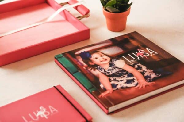
Use attractive visuals
Your visuals are what will catch people’s attention and make them want to read the rest of your brochure. So make sure that they are eye-catching and interesting, and that they accurately represent the contents of your brochure.
Use typography to convey a message
Your typeface can be used to communicate a message just as effectively as your visuals. So make sure that you choose one that accurately represents the tone and content of your brochure.
Use plenty of white space in your online brochure design
Too much text or too many visuals will overwhelm the reader and cause them to lose interest. So always use plenty of white space to give your brochure a clean and professional look.
 Venngage
Catalogue design should have balance
If you have more text than visuals or vice versa, your brochure will look unbalanced and amateurish. So always make sure to balance your text and visuals evenly.
This will ensure that your brochure looks professional and that the reader will be interested in reading it all the way through.
Use a consistent layout throughout your company brochure
If the layout of your brochure varies from page to page, it will look disorganized and confusing. So always use a consistent layout throughout your brochure.
Use a grid system for better alignment
A grid system can be used to align your text and visuals perfectly, making your brochure look neater and more professional.
Use color to create contrast
Color can be used to create contrast between different elements in your layout, making them stand out more prominently.
Use typography to create hierarchy
Typeface can also be used to create hierarchy, by making some elements of your layout more prominent than others.
Use a professional-quality printing process
If you are going to print your brochure yourself, make sure that you use a professional-quality printing process so that it looks as good as possible.
Use a fold to give your creative brochure extra visual interest
A fold can be used to add an extra layer of visual interest to your brochure, making it stand out from the crowd.
Some of the best ways to use these design elements to create visual interest in your brochure are by using a fold to give it an extra dimension, using color to create contrast, and using typography to create hierarchy. You can also use a grid system for better alignment, and a professional-quality printing process to ensure that your brochure looks its best.
Conclusion
Now that you know the 12 key elements to include in your brochure, it is time to get creative. With these tips and tricks for brochure design, you can create a stunning layout that will catch the eye of any potential customer.
So what are you waiting for? Get started today! If all this sounds too complicated or if have questions about how best to use these principles when designing your own brochure, then just go to Venngage and check out their robust array of brochure and flyer templates to easily make your own!