It was 34 years ago in March when Tim Berners-Lee initiated a proposal that would herald the World Wide Web, the precursor to the Internet. A year later, in 1990, he would come up with the very first web page. While it was just a simple page, Berners-Lee is nevertheless widely considered the forefather of web design.
Much of the Internet is essentially about the websites, web pages, and applications that we interface with when we go online. And much has happened since those early years. The incredible advancement in technology has revolutionized the way websites are planned, designed, built, and published.
As we mark a very important milestone that started it all, we look back into the evolution of web design in the last decades. From the birthing years to the modern era, we’ll go on a retrospective of the breakthroughs that made websites and web design what they are today.
This is the first in a series of articles about web design and the many aspects related to it. As with our other written pieces, this is meant to inform, inspire, and further intensify your passion for web design.
The History and Evolution of Web Design (Timeline)
Understanding Web Design – What It Is
Before we proceed, let’s first understand what web design is. A simple online definition search will tell you that basically, it’s the design and creation of a website. But that is a very rudimentary account.
Web design isn’t only the design part. It is more than putting in elements to make the website attractive. That’s because appearance is only half of the equation, the other is how it works. Web design is ultimately ensuring both aesthetics and functionality to benefit users.
To arrive at that outcome, web design will entail a process that incorporates purpose, planning, design, content, building, publication, maintenance, and every minute detail in between. All these ascertain that the website will stand out, operate as intended, and provide an engaging user experience.
We can go on but this would take another full-length article. Suffice it to say that understanding web design requires viewing it in its totality – an end-to-end system of processes and components to make a website look great and work great. That is web design’s raison d’etre.
Now to the subject at hand. Let’s begin our journey with the idea that started it all.
The Late 80s: Spark for the Web
In March 1989, British scientist Tim Berners-Lee wrote the initial proposal for the World Wide Web (WWW) which outlined the concepts and described a “hypertext project” where a “web” of “hypertext documents” can be displayed and read through a “browser.”
Berners-Lee was working at CERN (the European Organization for Nuclear Research). While the organization was based in Geneva, Switzerland, it involved a large community of 17,000 scientists from colleges and universities in more than 100 countries.
A reliable communication system was therefore imperative. Berners-Lee was working on a solution that could effortlessly find files and share information across a computer network. This was the gist of his proposal.

Image credit: google.com
In the world of design, “dark ages” was the apt description for this period wherein designers worked on pixels, numbers, letters, or tabulations to form shapes and outline on a dark screen. It was a barebones affair limited by the technology at hand. But all was about to change at the onset of the next decade.
The 90s: Beginnings and Breakthroughs
This decade was the formative years of the Internet but amazing and rapid technological breakthroughs would happen that would forever change how information and files are searched, shared, exchanged, stored, and hosted on servers, sites, and portals. These technologies would also impact how websites were designed and built, and how they would perform and function.
First Half
- 1990 February – Photoshop 1.0 was launched by Adobe Systems. It was a raster graphics editor that required a minimum of 2 MB of RAM and an 8 MHz processor. It was only available for the Macintosh computer.
- 1990 September – Archie, considered the world’s first search engine, was introduced by students from McGill University in Montreal, Canada. The tool was used for indexing FTP archives and helping users more easily search and download specific files.
- 1990 December – WorldWideWeb.app (the first browser) and httpd (the first server) were created by Berners-Lee. Said browser also served as a simple WYSIWYG editor. It was later renamed Nexus to avoid a mix-up with the WWW project.
- 1991 March – The Line Mode Browser was a simple browser and the second one created for the World Wide Web. It was also the brainchild of Berners-Lee and his team.
- 1991 August – The first website was a simple public introduction to the WWW. It was manually written in HTML and posted by Berners-Lee using the first website URL http://info.cern.ch/hypertext/WWW/TheProject.html. He expressed the belief that the Web could be useful to everyone and not just to the scientific community. The website was essentially just a webpage with hyperlinks to related information.

At this stage, web designers mainly worked with HTML tables to organize content vertically and horizontally. These were text-only pages, lacking any of the visual elements typical of modern web pages.
- 1991 November – HTTP v0.9 was the first Hypertext Transfer Protocol design made by Berners-Lee that allowed the exchange of hypertext documents (websites, images, etc.) between a server and a web browser.
- 1992 July – The first photo on the Internet was that of an all-female comedy band called Les Horrible Cernettes – or the Horrible CERN Girls – posted by Berners-Lee. The picture was taken by an analyst at CERN.
This period saw a growing number of early web servers as well as the development of early graphical browsers.

- 1993 January – The Mosaic browser had its first pre-release. The official release would follow in April while versions for Mac and PC were launched later in the year, making it the first widely available browser. It was able to integrate multimedia like graphics and text.
- 1993 April – The Web was placed into the public domain as an open standard. Late in the year, there were 500 web servers.
- 1994 January – Yahoo, short for “Yet Another Hierarchical Officious Oracle,” was born and became the dominant search engine.
- 1994 October – The Cascading HTML Style Sheets (CSS) was first proposed by Norwegian programmer Håkon Wium Lie who at that time was working at CERN under Tim Berners-Lee.
- 1994 November – Geocities, a web hosting service, was started. It allowed users to build and publish websites at no cost and to browse (by interest or theme) user-created websites. Yahoo acquired Geocities in January 1999.
By end of 1994, there were 10,000 web servers and 10 million Web users.
Second Half
- 1995 – JavaScript, a programming language and one of the key technologies of the WWW (together with HTML and CSS) was invented.
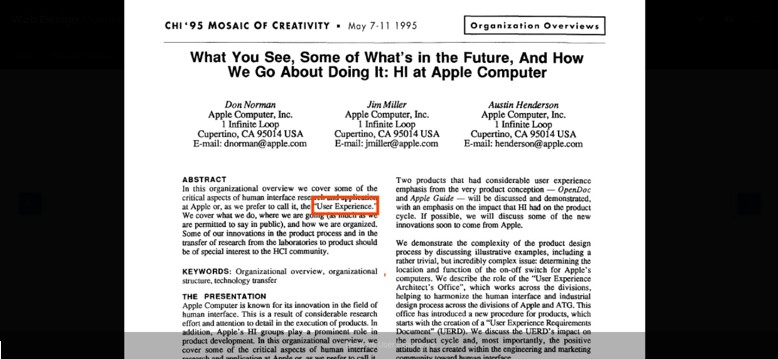
- 1995 May – The term “User Experience” was first publicly heard during the CHI ’95 Conference Companion on Human Factors in Computing Systems held in Denver, Colorado. It was a presentation by Apple Computer.
- 1995 November – HTML 2.0 was published and was to become the standard for all future developments of this Web technology. The first known description of HTML was four years earlier in a document called HTML Tags by Berners-Lee.
- 1996 August – Microsoft’s FrontPage, a WYSIWYG HTML editor, saw its initial outing with the release of Windows NT 4.0 OS. It was designed to hide from users the code details of HTML pages which enabled novices to create websites and web pages more easily.
- 1996 November – FutureSplash was acquired by Macromedia and rebranded as Flash 1.0. As Flash underwent further development and matured, it added scripting capabilities that allowed web designers to create dynamic websites with multimedia elements and content.
- 1996 December – The Cascading Style Sheets, level 1 (CSS1) gets official recommendations for language specification by the World Wide Web Consortium (W3C).
- 1997 – “Cascading Style Sheets: Designing for the Web” was published. It was written by Håkon Wium Lie and Dutch developer Bert Bos who considerably contributed to the specs of CSS1.
- 1998 July – Adobe ImageReady 1.0, a bitmap graphics editor, was released. It was designed to work with web graphics and later became part of Photoshop.
- 1999 April – Web 2.0 was first introduced in an article by Darcy DiNucci titled “Fragmented Future.” The term describes the Web’s development wherein website content is created and shared mainly by users themselves such as web forums, social networking sites, and photo/video sharing portals.
- 1999 June – Adobe Photoshop 5.5 was launched which included the Adobe ImageReady 2.0 program for web graphics and a new feature – Save for Web – that allowed designers to compress an image for the web.
- 1999 August – Blogger.com, one of the earliest blogging platforms, was born. It would usher in the blogging era and popularize blog websites as online platforms for personal, corporate, and business purposes.
- 1999 November – 2Advanced Studios, a US digital creative agency, was established. It was well-known in the design community for its trail-blazing, cutting-edge website designs utilizing Flash.
- 1999 December – Designing Web Usability: The Practice of Simplicity was published. The book was written by web design and web usability expert Jakob Nielsen. It would become an essential reference in the area of web usability and the emerging discipline of user experience design (UX).
2000 – 2009: Technological Strides
Advancements in the Web in the previous decade set the motion for newer technologies that defined how websites were created, accessed, and used. Blogging and social media platforms boomed and web-capable phones arrived necessitating web designs that can attract online and mobile audiences.
First Half
- 2000 January – XHTML 1.0 gets official recommendations for specification from the W3C. The Extensible HyperText Markup Language was designed to create hypertext documents for the Internet environment. It was an integration of XML and HTML and was supposed to be the successor to HTML but wasn’t fully realized with the development of HTML5 in 2007.
- 2000 October – The book Don’t Make Me Think by information architect and UX designer Steve Krug, was published. It deals with Human-Computer Interaction (HCI) and web usability. His idea was that websites or computer programs should work as intended and be simple enough for users. This became the underlying principle for the design of websites and apps.

Image credit: webdesignmuseum.org
- 2001 March – Online magazine Pixelsurgeon started publishing. It would become the go-to site for news and resources focused on design and the Internet. It closed in November 2007.
- 2001 September – Scalable Vector Graphics (SVG)became a W3C recommendation. SVG has been in development since 1998 and is an XML-based graphical vector file format that supports animation and interactivity. It has become the basic open format for web pages using vector graphics.
- 2001 December – Audi.com, the first partially “responsive” website, was launched. The site was designed by the Razorfish digital agency for the noted car maker. It was not a truly responsive web design known today but instead a design customization that optimized content sizes into 640×480 px, 800×600 px, and 1024×768 px resolutions based on the width of the browser window.
- 2002 June – Mozilla 1.0 was released based on the open-source Gecko rendering engine that significantly enhanced the support for web standards.
- 2003 May – Designing with Web Standards, written by web designer Jeffrey Zeldman, was published. The book explores the advantages for web designers in properly implementing web standards to create user-friendly and accessible websites that work well in various browsers.
- 2003 May – WordPress 0.7, the first iteration of an open-source content management system, was created. WP would become the most popular CMS and power 40% of all websites today.
- 2003 August – The MySpace social network was founded. It would reign supreme for the next five years until Facebook came into the picture.
- 2004 February – Flickr, a photo-sharing community, was launched. It was a prime example of Web 2.0 wherein the website’s content was mainly created and shared by its user members. It was among the first to implement photo tagging.
- 2004 November – Firefox 1.0 was released by Mozilla Corporation. It featured improved web standards support, better security, and several plug-ins that can be additionally installed.
Second Half
- 2005 August – The Opera Mini was introduced as a web browser for mobile phones. It could be installed on the most commonly used mobile phones at the time. It utilized the unique Small-Screen Rendering tech where requested pages were first optimized on Opera servers before being displayed on the Opera Mini Browsers on users’ phones.

Image credit: blogs.opera.com
- 2005 December – Adobe buys rival company Macromedia for $3.4 billion and takes ownership of the latter’s multimedia design tools like Flash, Dreamweaver, Flex, Fireworks, Freehand, Captivate, and Director.
- 2006 March – Twitter was officially launched and would introduce a new way of sharing news and ideas through posts called “tweets.”
- 2006 August – The Smashing Magazine was created as a portal for web developers and designers. It would provide regular news and updates on the world of web design, web development, user experience, etc. Today, it is the most visited site for web design and related areas.
- 2007 January – The first iPhone was officially announced by Steve Jobs and made available by June. It allowed for easy web surfing with its own built-in Safari web browser.
- 2008 September – Google Chrome beta version was released for Windows. In four years, it would surpass the popularity of Internet Explorer and by 2018 would account for over 66% of the global browser market share.
- 2009 July – Flexbox or CSS Flexible box layout gets W3C issuance for the first proposal of specifications. It provided a new way for creating web layouts, easier elements alignment, and better space distribution to the display resolution of a device. Presently, these flexbox features are supported by major browsers.
- 2009 September – The CSS Awards was launched recognizing innovatively designed and highly creative CSS-based websites. In 2011, it was renamed Awwwards.
- 2009 November – Microsoft’s handheld Zune multimedia player was made commercially available. Its control features carried a clean and simple design and were deemed among the first application of flat design in user interface.
2010 – 2019: Era of Modern Web Design
This time onward saw the rise of responsive designs. Designers explored new grounds with bold, unique, and out-of-the-box web designs that took advantage of maturing web standards and technologies, and made possible the seamless integration of multimedia elements in web design.
First Half
- 2010 May – The term “responsive web design” enters the design vocabulary and is credited to web developer Ethan Marcotte in his 2010 essay of the same title. Previously, terms like “elastic,” “liquid,” and “flexible,” among others, were used to describe the concept.

Image credit: blog.coffeeandcode.com
Marcotte published a book in 2011 titled simply “Responsive Web Design.” It further expounded on the new way of styling HTML documents that allowed the optimized display of website content to display size or resolution. Techniques for responsive web design include flexible images, fluid grids, CSS3 modules, and media queries.
- 2010 October – Windows Phone 7 with flat design UI was launched by Microsoft. The visual style received positive feedback and flat design elements would be applied to the Windows 8 graphical interface.
The flat design gained traction among web designers after 2010 because it was minimalist and modern yet bold and exciting. Before flat design, the popular design style was skeuomorphism which depicted physical objects through realistic representations and often used elaborate typography, textures, and complex graphics.
The flat design removed these cumbersome elements which led to faster loading of websites and easier understanding of content. When Windows 8 was released in 2012, the flat design cemented its place in design history. It allowed for a compelling user experience, contributing to its staying power. Even to this day, flat design is applied in websites, apps, user interfaces, and graphic design.
- 2011 August – Bootstrap 1 was released as an open-source tool and would become one of the most widely-used CSS frameworks among web designers. It was meant for responsive, mobile-first, front-end web development and contained HTML, CSS, and JS-based design templates for interface components like buttons, forms, and navigation.
- 2012 June – CodePen, an online community for showcasing and testing HTML, CSS, and JS code snippets, was founded. It allowed designers and developers of all skill levels to edit front-end languages through a browser-based code editor with results shown in real-time.
- 2012 June – Media Queries got an official recommendation for specification from the W3C. It is one of the basic techniques applied in designing responsive websites, allowing for adaptable web page rendering based on screen size or resolution and other factors.
- 2013 May – The creation of React JavaScript Library is announced. Also referred to as ReactJS or React.js, the open-source library makes it easier to create UI components and interfaces for Web applications, including single-page or mobile apps.
- 2013 August – Bootstrap 3 CSS framework is published by a developer team from GitHub. This version can consistently apply a mobile-first access and responsive web layout. Moreover, the layout of components and templates was restyled with flat design.
- 2014 June – Material Design, a new graphic style, was introduced by Google which describes it as a visual language that fuses classic principles of good design with the innovations of science and technology. The style has since been used by Google to redesign its products and services.
- 2014 October – HTML 5 markup language gets a final recommendation for adoption by the W3C. This version offers new semantic tags (to better define the structure of a page), the tag that interprets vector graphics (with insert images option), and enhanced multimedia playback support for browsers.
Second Half
From here on, with most web standards and technologies approved, adopted, and in place, this will be a general account of significant developments and trends in the world of web design.
2015
- Year of Engagement. 2015 saw the use of dramatic colors, extra-large titles, distinct typefaces, and site backgrounds made of hi-res images or hi-def videos. Search bars, menus, and navigation were hidden or altogether discarded. These were meant to provide website visitors with an engaging online experience.
- Flat Design and Minimalism. These two design styles made a comeback but with a twist. Unlike truly minimal or bare layouts, web designers added playful colors, highlights, drop shadows, gradients, and other extra trimmings.

Image credit: advntdesign.com
- Interactive Elements. The use of advanced animation, multimedia, and interactive elements in websites become more prevalent. The shift in newer technologies like HTML5 and CSS3 made possible the creation of various interactive experiences.
- “Unboxed” Designs. Page elements were no longer hindered by the rectangular box of the monitor screen. Employed were irregular shapes like blobs, swirls, and hexagons as well as 3D effects to provide illusions of depth and movement.
2016
- Adobe terminated Flash. The company announced in June that its support for Flash would cease by 2020. Designers would eventually shift to HTML5, WebGL, and newer technologies for multimedia web applications and interactivity.
- Figma was Launched. In September, Figma became the first design tool that merged browser-based accessibility with native app functionality, allowing for real-time collaboration on the same file.

Image credit: gs.statcounter.com
- Mobile exceeds Desktop. For the first time, mobile usage exceeded desktop usage. More and more people were going online using their web-connected phones and tablets, and web designers were responding with mobile-first and responsive websites.
- Dynamic Typography. Minimalism continued but with bright images and bold typography. Headings and banners got bolder and bigger, and Google Fonts and Adobe Fonts made it easier for designers to customize fonts on websites.
2017
- Hidden Menus. The practice of hiding menus on small mobile screens (a practical necessity) was adopted on desktops as well. Designers applied some ways to disguise or hide the navigation menus which prompted clicks or actions from users.
- Split Screens. Having two sections or web pages together vertically side-by-side on the screen found favor among designers and users as it invoked the experience of reading a magazine or a book.
Image credit: fireart.studio
- Cinematic Visuals. Full-screen video backgrounds was not new but found renewed usage and interest among web designers. It added to the visitor experience by showing engaging hi-def videos in the background overlayed with headings or navigation.
2018
- Unique Shapes and Layers. More unique layers, shapes, and drop shadows appeared on websites, thanks to browsers that supported newer layout elements like the CSS Grid. Floating shapes created a sense of movement while drop shadows produced a sense of depth.
- Design Divide – Mobile vs. Desktop. Web designs for mobile became simpler while those for desktop became more complex. It was a natural design division based on the device’s processing capability. Websites with simple designs would naturally load faster on a mobile device.

Image credit: wix.com
- Retro Look. It was a throwback year as web designs took on retro looks and elements. The approach was subtle but often involved combining vintage-inspired palettes with bright colors and bold shapes.
- Illustration and Animation. Custom illustrations and stylized animations took hold during the year, providing a playful, friendly, and colorful atmosphere to websites.
2019
- Serif Returns. Traditionally reserved for print design, serif typefaces made a comeback pushed in part by the revival of minimalist and retro designs. But designers still held a preference for sans serif for body copy.
- Further Interactive Elements. More interactive elements were introduced by designers to entice and engage users. These included animated graphics, fading titles, page transitions, and sliding images, among others.

Image credit: makerhive.com.hk
- Natural and Organic Shapes. Sharp, geometric shapes took a backseat to more fluid, natural, and organic shapes. With curves and arcs instead of straight lines, it added a sense of depth to the design.
- Deviating from Generic Images. The shift from standard, generic photos to more diverse pictures from all ages, gender, and cultures, gained traction among the websites of big brands and businesses. Design embraced diversity.
2020 and Beyond
The evolution of web design is determined by advancements in technology. 2020 and beyond would require a later exploration. However, going with what web design’s history has shown us, it will be an exciting outlook as technology progresses by leaps and bounds. Especially so with the emergence of artificial intelligence.
This rapidly progressing field of AI will have quite an impact on the future of web design. We’re already seeing its cutting-edge capabilities in AI-powered website builders, image generators, logo makers, and smart content and copy creators. It gets you thinking if the title of web designer means anything at all today when anyone can design and create a website with codeless site builders.
So where do we go from here when machines can now do the task for us? Let’s wait and see. There is excitement in using AI design programs yet there is trepidation that in the not-too-distant future, it may take over your job. Meantime, take advantage of what it brings to web design such as convenience, speed, efficiency, and more possibilities.
Sources :
– Article on Webdesign Museum