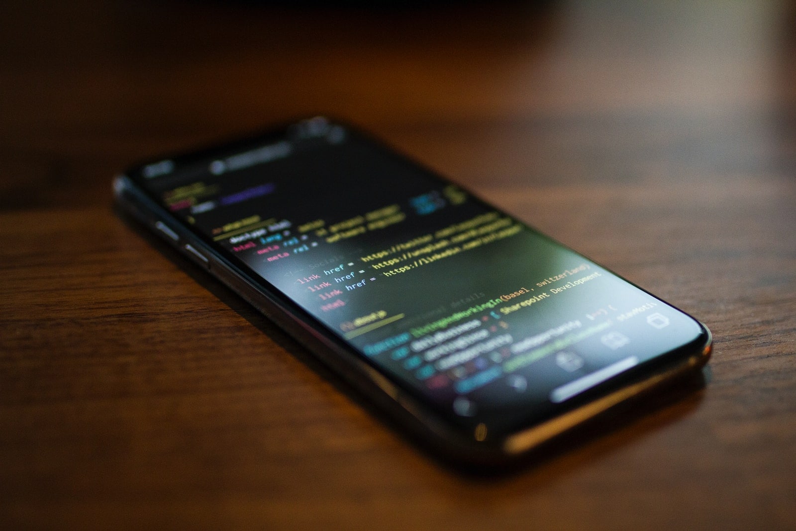
Mobile-first design is not just a trend in the design world. It’s become so important because it addresses fundamental problems with existing web pages, including desktop websites designed to be viewed on large displays.
The fact is, more Internet users are viewing content through mobile devices than ever before. And according to Google’s John Mueller, Google has started using mobile sites as ranking factors for their search results.
This article will look at what you need to know to get the mobile-first design right the first time.
When Should You Adopt Mobile-First Design?
Before we talk about how to create and apply a mobile-first design, let’s discuss whether or not you should even bother with it in the first place. As we mentioned before, recent statistics indicate that more people will access websites from their phones than anything else—the desktop is no longer king. But some argue that designing your site for mobile devices will only waste time and money without providing any real value to users.
Here are two potential reasons why you shouldn’t rush it:
Mobile Is Not Always The Default View
Desktop users are in the minority, but they’re not nonexistent. If your website is designed for desktop users first, you’re neglecting most of your audience. And if someone visits your website from a device that’s not their primary means of browsing the Internet, they may have to do some extra work (like pinch and zoom) to see your content in a way that’s comfortable for them.
Your Mobile Site Is Less Important
This reason sort of goes hand-in-hand with the last one. If mobile devices aren’t your site’s main priority, then why put in all the extra effort? You can get away with making less effort on your mobile site because it’s not as important as the desktop site.
But even though these reasons have some validity, they don’t tell the whole story. Mobile-first design should not be seen as a replacement for desktop design; it should be viewed as an addition that enhances the user experience overall. And when done correctly, it can provide real value to your users.
Let’s take a look at some of those benefits.
How Mobile-First Design Enhances The User Experience
One of the biggest problems with mobile devices is that their screens are often too small to display all content on a page at once. This can lead to a lot of horizontal scrolling, which is inconvenient for the user and bad for your website’s SEO. Mobile-first design solves this problem by prioritizing the most important content and hiding the rest behind a menu or icon. This allows users to focus on what’s important without having to scroll through a bunch of extra text and images.
2) It Makes Pages Load Faster
Mobile devices often have slower Internet connections than desktops, so it’s essential to make sure your pages load as quickly as possible. Mobile-first design does this by minimizing the amount of data to be loaded to see the content. You can avoid cluttering up your pages with unnecessary images and scripts by focusing on the essentials first.
3) It Makes Development And Maintenance Easier
Designing for mobile devices can be a challenge, especially if your website has a lot of different pages and sections. It can be not easy to make sure that every page looks good when viewed on a mobile phone, so it’s common for developers to have to create separate interfaces for phones and desktop browsers. Mobile-first design solves this problem by making all the interface elements responsive—this means they will change their size depending on what kind of device is being used to access them.
4) It Creates A Better User Experience Over All
One of the main goals in mobile app development is creating an easy-to-use interface, but this isn’t always true with websites. Since you only have one shot at getting someone to click on your link, website designers try their best to cram as much information as they can on their pages, leading to congested layouts that are more annoying than helpful. Mobile-first design solves this problem by focusing on the essentials and de-cluttering your pages. Eliminating unnecessary elements makes it easier for visitors to focus on what’s essential and get through your site quickly, which will lead to increased engagement and conversions.
Mobile vs. Desktop: A False Dichotomy
For years, web designers have created desktop sites that don’t always work well when viewed on mobile devices. Google has said that half of all website traffic comes from mobile phones. But thanks to the popularity of smartphones over the last decade or so, we’ve reached a point where designing for one or the other is no longer an option.
This is where mobile-first design comes in. Rather than designing for desktop first and then adapting it for mobile devices, mobile-first design starts with the assumption that all users will be viewing the site on a phone or tablet. This can be a difficult shift for some designers, but it’s important to remember that the mobile web is now a reality, and ignoring it will only lead to decreased traffic and lost sales.
So how do you go about creating a mobile-first website?
The first step is to create a style guide that will act as a blueprint for your website. This guide should include all of the different elements that will be used on you and their corresponding dimensions and spacing. Once this is complete, you can start to build out each page on your site, prioritizing content and de-emphasizing anything that isn’t necessary.
This strategy takes a bit of extra time initially, but it’s worth the effort in the long run. Not only will mobile-first design make your pages more accessible for all users, but it can also help lead to higher conversions and increased returns by giving visitors precisely what they need without any unnecessary distractions.