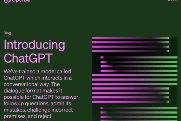
The concept of a landing page is simple; it is a static, standalone page designed to funnel visitors towards a specific course of action. For example, the desired action might be purchasing a product, signing up to a mailing list, or visiting other pages that further explain the proposition. But, what all landing pages should have in common is a narrow function.
The limited purpose that these pages have might make you think that creating a landing page is straightforward. However, as these pages are the one chance you have of grabbing and holding a first-time visitor’s attention, a landing page must be designed with care. Indeed, visitors will bounce back out of the page just as fast as they came in if you get the design wrong. So, here are ten tips to help you create landing pages that convert.
Determine a Single Goal
Before you begin designing a landing page, you must have a single goal in mind. And then, every element on that page must play a part in achieving that goal. In other words, it is best to avoid having any content or design features that might distract the user from taking the desired action. And, the message mustn’t be diluted by multiple choices, making visitors hesitate and become indecisive.
Plan the Layout of Landing Pages
A landing page needs only a few elements to be persuasive enough to achieve results. So, To keep landing pages clean and focused, it is best to plan the content before you begin work on the page. The first element you will need is a short be an engaging headline. Then, it would be best if you had a brief, punchy description of your offering along with any relevant images that reinforce your message. Finally, you will need a compelling call to action and a lead-capture or sales order form that is straightforward to complete.
Keep the Content Concise
People will only take a few seconds to decide if they want to hang around on a landing page to learn more or quit the page and look elsewhere. So, it is best to avoid using complex language or long-winded descriptions on landing pages. Instead, use plain language and keep sentences short and punchy. And, if lengthy descriptions are unavoidable, break up text with subheadings or use bullet points.
Get the Main Message Across Above the Fold
Visitors to a landing page must understand the benefits of the offer immediately on arrival. So, the most critical information should be located at the top of the page. Also, it is best to have a call to action in sight above the fold. Then, you can have more information that expands on the top-of-the-page snapshot if required. And, you can have multiple calls to action further down the page to tempt visitors as they scroll down through the content, so they don’t have to scroll back up to take the desired action.
Use Images and Media to Your Advantage
Everything must have a purpose on a landing page. So, images should be considered a tool to encourage conversions rather than merely pretty pictures to enhance the page’s visual appeal. Indeed, people take in the meaning of visuals far faster than words. So, you could use images to enhance the attraction of the offer. Or, you could use video to explain a complex product or to reinforce a sales message.
Limit Exit Opportunities
You want people to take the desired action, not get distracted, and wander off to explore another part of your website. So, unlike other pages on a site, landing pages should have few or no exit opportunities other than following the call to action. You might want to remove social sharing buttons, for example. And hide the main navigation bar on a landing page. It is also advisable not to have any external links leading a visitor to an alternative site.
Have One Landing Page for Each Campaign
Landing pages are usually used in conjunction with social media or cost-per-click (CPC) advertising campaigns. And CPC and social media ad campaigns are typically specific. So it will be best to have specific landing pages for each campaign and each traffic source. If you use campaign-specific landing pages, you can tailor the content of each page to follow on from what was offered in the ads. Then, your landing pages will be more persuasive because the user will transition naturally from the ad that first interested them to the squeeze page that converts them.
Offer Something of Value
Whether you ask people to part with their money or their email address, you will need to offer something of value in return. So, be sure that your content clarifies what the user gets out of following your call to action. For example, a free ebook or a special discount could be used to tempt people to subscribe to a mailing list. Or, if you are selling a product, the benefits of that product must be clear from the landing page’s content.
Use Persuasive Calls to Action
The calls to action are probably the most crucial element on a landing page. After all, if visitors fail to click that button or follow that link, your landing page has failed to achieve its objective. So, make sure that CTAs are easy to find and contain text to make people want to take the desired action. Use contrasting colors for your CTAs, for example. And use short, commanding phrases that tell the users what to do next.
Test and Refine
Of course, there will be various ways to format landing pages for your various campaigns. And, some of your ideas will work, and some won’t. So, the best way to hone your landing pages to perfection is to carry out A/B testing and monitor the conversions for each page. Then, when you have found the perfect landing page format for your offering, you can recycle that format for use on similar campaigns. But, remember, a landing page can almost always be improved. So, keep on refining and keep up the A/B testing.
Conclusion
The above may seem like a lot to keep in mind when designing a simple landing page. But if you get the above design elements right, it could significantly improve your conversion rates. So, keep it simple, get the message across above the fold, and use clear calls to action. And, don’t forget to keep on A/B testing and refining your landing page designs.