VISIT WEBSITE
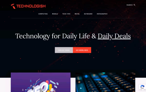
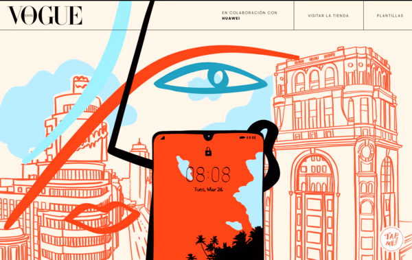
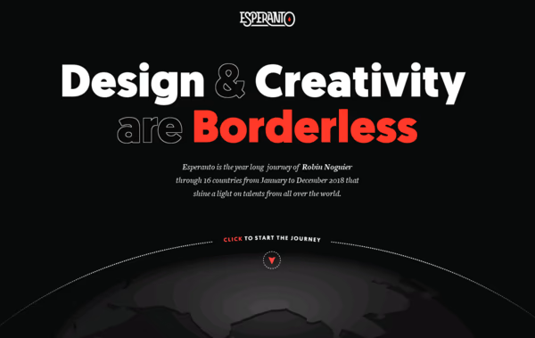
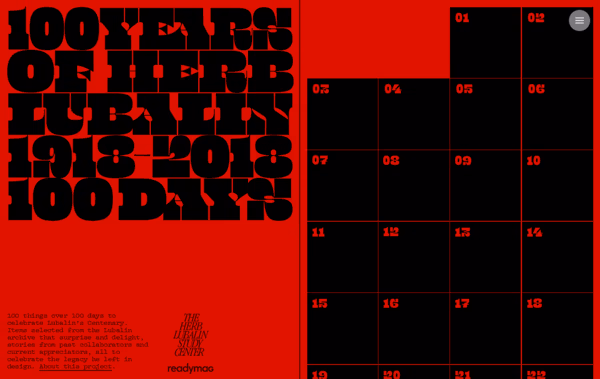
If you are looking to launch or redesign your magazine style website or blog, our design inspirations will give you plenty of ideas to help you come up with a look that works for you.
Whether you’re looking to monetise your content or simply want people to spend time reading your magazine or blog, you need to ensure your site is attractive and engaging for readers. Furthermore, you need to present your content in such a way that it’s readable, and ensure your site is somewhere readers can spend hours getting lost in your words.
One of biggest things that many people don’t realize when creating a modern magazine or blog style website is that they need something different to a site that sells something. How people move around and interact with magazine and blog website is far different to how they interact with an eCommerce site, for example.
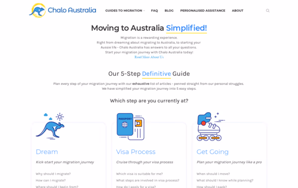
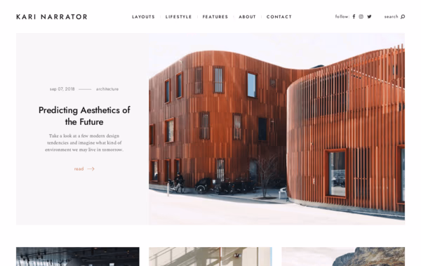
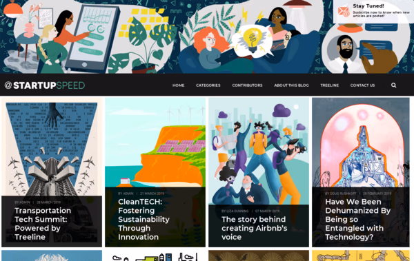
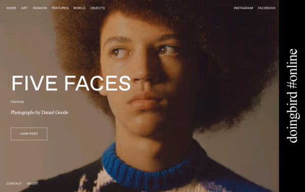
Use our inspirations to find the best magazine or blog design that works for you.
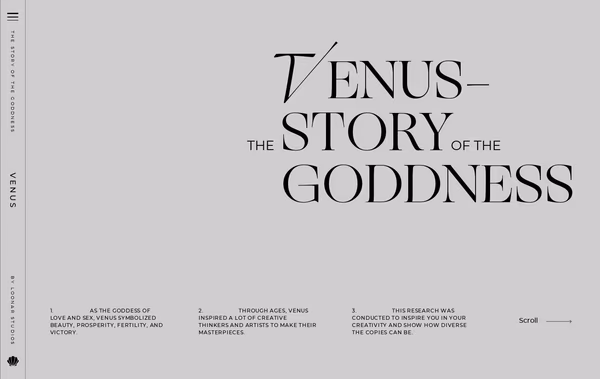
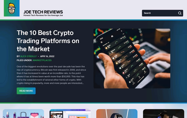
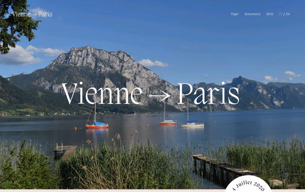
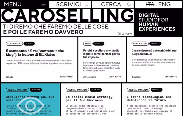

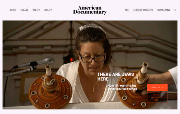
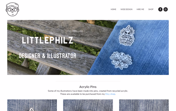
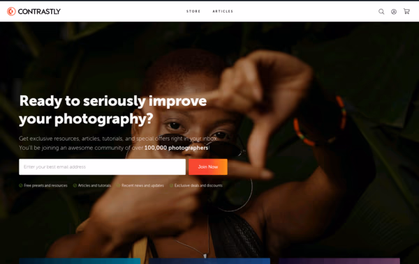
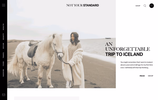
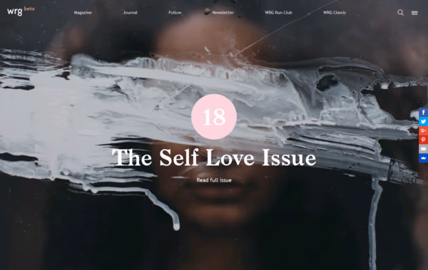

Whether your entire website is dedicated to blog content, you’re launching a modern online magazine, or you’re simply looking to design a blog for an existing website, getting your design right is vital to your success.
One common mistake people make when designing an inspirational magazine or blog style site is using the sort of design that you might find on an eCommerce or Corporate website. However, people move around and interact with magazine and blog style websites in a different way. After all, you’re not trying to sell something, but you might be trying to get people to sign up to a mailing list, click an internal link, or maximize your ad revenue.
You should keep all these things in mind when choosing a magazine or blog website design that works best for you.
The way website visitors interact with a magazine or blog is far different to how they’d interact with an eCommerce website. Think about the differences you can identify between the two. How would you act on each type of website? We all read and look for key information in a similar way. Yet, how we look for information in a collection of text differs from how we look for information when buying a new pair of pants.
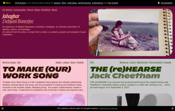
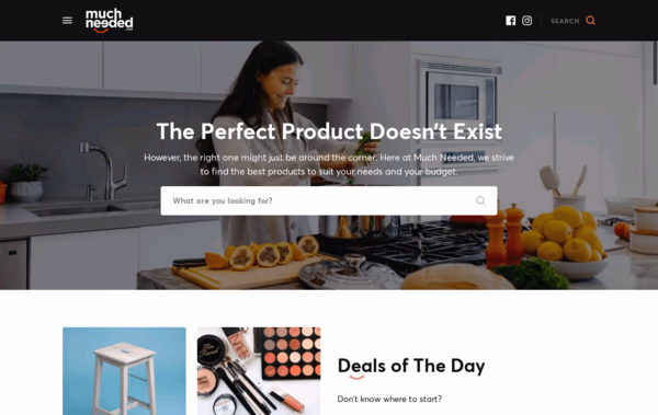
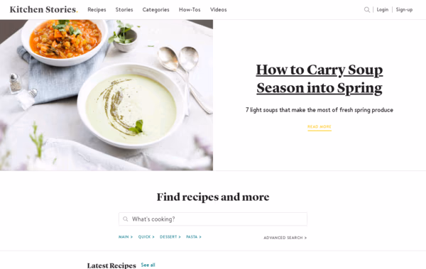
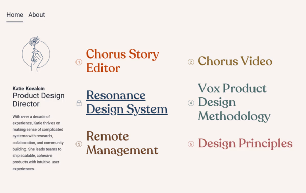
It’s also vital you consider using different designs for different parts of your magazine or blog site. For example, you might use an eCommerce style tile design approach to highlight all your content, while opting for a single column format within the content itself.
The best way to find a suitable design that is on-trend is to consider what you want to achieve from your website. If you’re simply creating a personal blog where you want to write your thoughts on a hobby, you have a different goal from someone looking to monetise a mailing list or generate revenue from an affiliate program.
Consider both your goals and how people are likely to interact with your website when choosing a design.
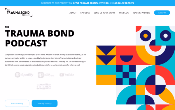
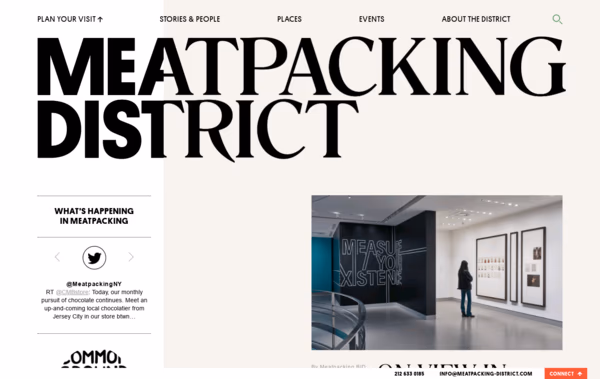
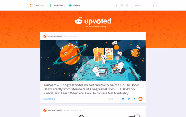
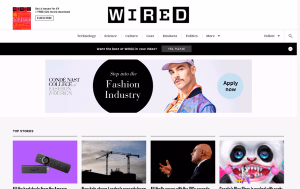
You have several choices when it comes to selecting color schemes for your magazine or blog. Most traditional and creative websites that you might use as inspiration, such as news websites, tend to use white backgrounds with black text. You don’t necessarily need to do this yourself, but you should think about the reasons why sites use such color schemes.
It’s because they’re easy to read.
If you want a highly engaging website, a bright blue background with yellow text probably isn’t the best way to achieve your aims!
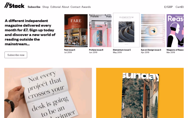
While you might use a tile-based design for your homepage, single column designs are often best for your content pages. These minimise distractions and make it easy for readers to focus on your text. If you’re looking to use your content to provide information about a service or product, earning the reader’s focus will be a key component of your success, so it’s worth keeping these options in mind when choosing a design.
Most popular blog posts : History of web design - Best unlimited graphic design services - Divi Coupon - Mouse for Graphic Design